If the average amount of time people spend each day on Facebook in 2019 is 38 minutes, and an average Facebook user clicks on 8 ads per month, a good question that may arise is:
How can brands create a more helpful ad experience on social networks and be less interruptive?
In a previous post, we walked you through the Facebook ad formats. In this post, we will try to answer the question above and we’ll get inspired by some killer Facebook ad examples. We’ll dive into the tips and tricks on how effective ads are crafted – from invisible to remarkable.
Stick with us, by the end of this article you’ll find at least one new ad idea to try for your business, no matter the industry.
Facebook Ads Library - The Best Way To Spy On Your Competitors
In order to create high ROI Facebook ads, you need to do your research. For this article, we have to confess that besides being targeted or retargeted by certain brands, we have also been spying on big brands to collect some amazing Facebook ad examples.
How have we done that? Glad you asked! We used Facebook Ads Library – a transparent, searchable collection of all ads currently running from across Facebook products. This is a pretty recently released tool, you can also find it in the Page Transparency section of any Facebook page.
You can use this tool to search by business name, topic or keywords. However, the keyword search can only be used for ads about social issues, elections or politics, and will return results for both active and inactive ads for seven years from the date of the first impression.
Once you look at a particular company, you’ll see all the ads it’s currently running. You can also filter by country. So, whenever you want to spy on your competitors or just look for some inspiration, check this tool. You can see the ad copy they’re using, the images, the headline, the call to action, even the date the ad was created.
Pro Tip On Using Facebook Ads Library
You can find out your competitors’ best-performing Facebook ads by simply looking at the old ones that are still active. What would be the point of running an ad for 10+ months if it didn’t meet its objectives? So, check them out, see how often they are changing creatives, what is their strategy and what they are offering.
13 Stellar Facebook Ad Examples
Here is a collection of 13 fantastic Facebook ad examples taken from various industries and meant to inspire you. The list is far from being exhaustive, we will continuously update it with fresh new examples. However, take them with a grain of salt, everything needs to be tested to see if it works for your business too.
Example 1: AdEspresso (Retargeting Ad)
What makes this Facebook Ad example stand out?
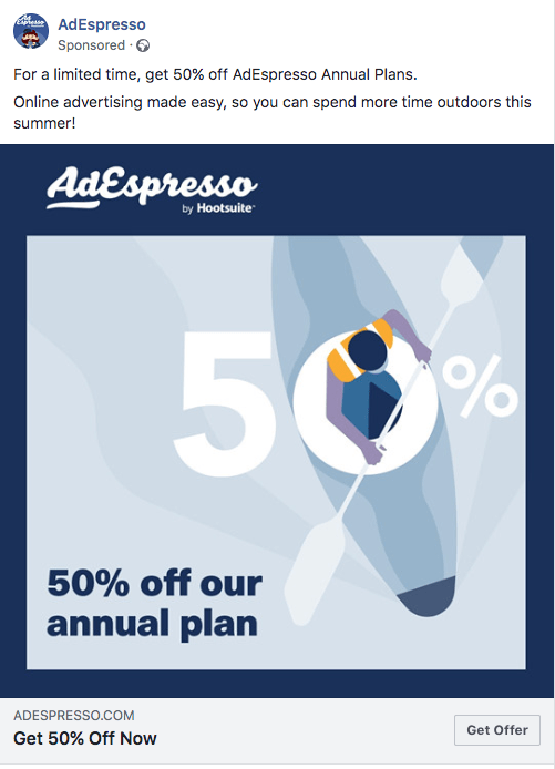
Keeping it simple! This is exactly what this ad does. It has an eye-popping illustration (and not using free stock photography!), well connected to the ad copy, a matching color scheme, a good offer beautifully displayed on the image and in the call to action. This is a great Facebook retargeting ad example.
Example 2: Hopper HQ (Image Ad)
What makes this example stand out?
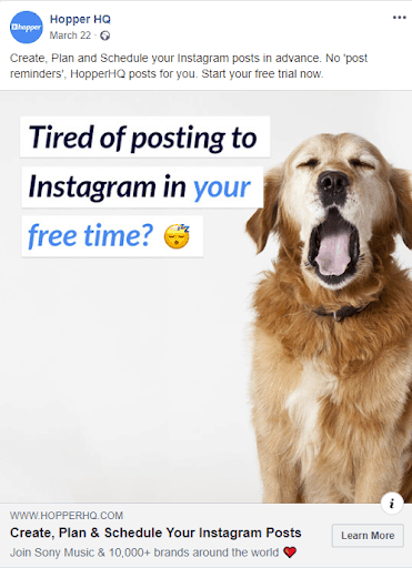
It promises a quick win. Hopper HQ shows they understand their audience struggle of posting to Instagram in their free time, which makes them more qualified to offer a solution to this problem: they will post for you, so no more “post reminders”.
Words like “tired”, “your free time” (which is clearly highlighted), emojis, and a cute sleepy dog will grab the user’s attention. More than that, this ad builds instant trust by using numbers. Notice how they’re enforcing the brand by mentioning they have the trust of “Sony Music and 10,000+ other brands”.
Example 3: ClickCease (Video Ad)
What makes this Ad example stand out?
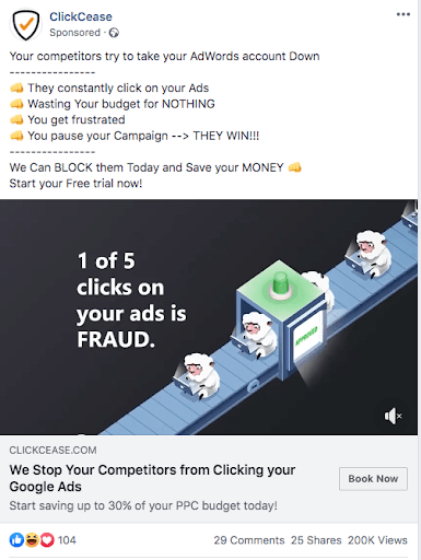
This is a Facebook video ad example from ClickCease, a click fraud prevention company. It has clarity and it addresses a business pain point: clear statement in the ad copy, and a clear benefit. It also uses emojis, which is a hack for higher CTR and engagement rate. They describe a problem and come up with a solution.
And the most important aspect of this ad – it embraces the power of visuals. Our brains process visuals at a 60,000 times faster rate than text. Watch ClickCease’s video below and see how they match it with the ad copy.
Example 4: ProRankTracker (Image Ad)
What makes this Facebook Ad example stand out?
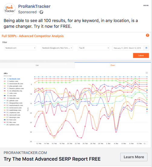
At first sight, this may look like a crowded image, but it actually displays an as-is screenshot of an advanced SERP report. The target audience that will not get scared away when seeing this graph is made of experts.
They will see exactly what they’re getting, including the benefits of using the service: “all results, for any keyword, in any location”. Plus, the ad’s call-to-action highlights the free trial.
Example 5: Design Pickle (Lead Ad)
What makes this Facebook lead ad example stand out?
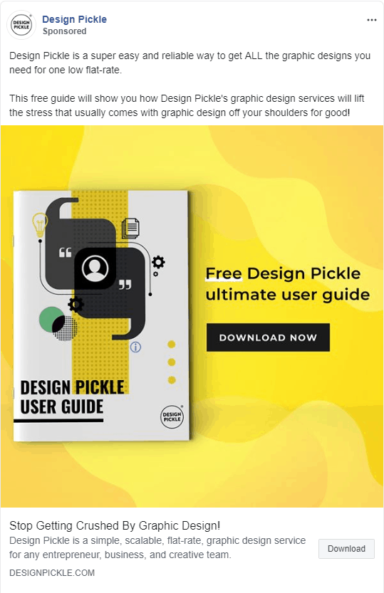
Design Pickle promises the complete answer to graphic design stress: a quick way to opt into a free, ultimate user guide, and most importantly – without leaving the Facebook news feed. The vibrant image attracts the scroller’s attention and it shows their design skills.
Example 6: Yoga International (Video Ad)
What makes this example stand out?
This video ad earns people’s trust by showing expertise in the yoga field. It makes sense to be assisted by expert yoga teachers when building strength for endurance. The free giveaway and the 30-day trial period are great ways to get people to engage with the brand.
Example 7: Hotjar (Image Ad)
What makes this example stand out?
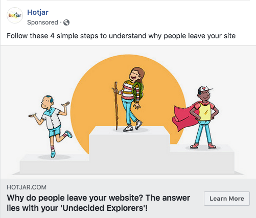
To get people curious to click the ad, Hotjar brings out a clear benefit of using their service: understanding why people leave your website. Asking this question in the headline? Even better! The answer lies on this ad’s landing page.
Example 8: Grammarly (Video Ad)
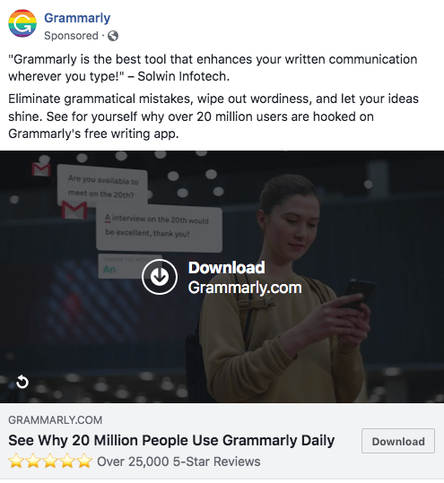
What makes this Video Ad example stand out?
Including a customer review, a clear benefit and a numerical proof can help lift up sales. The 5-star social rating adds a powerful touch. This ad is another example of a good use of visuals. Aren’t you curious now to see why 20 million people use this service daily? Well done, Grammarly!
Watch the full video ad below:
Example 9 - ProveSource (Image Ad)
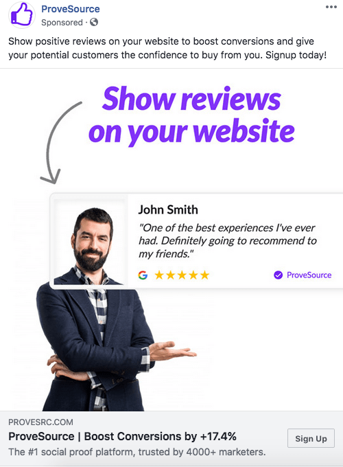
What makes this Ad stand out?
Every marketer or business owner knows how important and effective testimonials are. And what better ad from a social proof platform than a social proof ad? Oh, and let’s not forget the numbers. It’s always a good idea to include numbers in your Facebook ads if you have share-worthy results.
Write a simple headline with a clear benefit based on your results: “Boost Conversions by +17.4%”. Also, mentioning the number of people benefitting from your product (4000+ marketers in ProveSource’s case) helps to create more trust for your brand.
Example 10: The New York Times (video Ad)
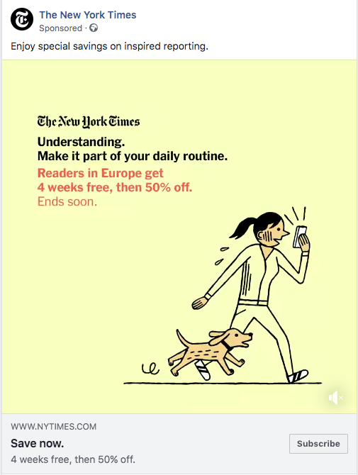
What makes this Example stand out?
This illustration drew my attention with the well-crafted imagery. The message is clear and short – “understanding” can be part of your daily routine. The ad has a good offer and it also creates a sense of urgency: “4 weeks free, then 50% off”.
Example 11: The Economist (Video & Carousel Ads)
What makes these Facebook Ad examples stand out?
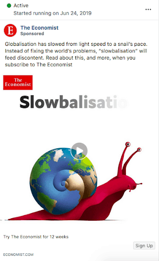
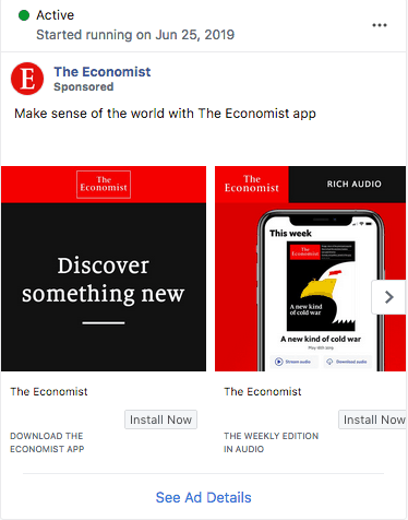
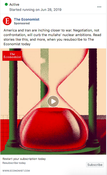
These are three examples of different message approaches from The Economist. The first one gives us a sneak peek into an article and asks for a subscription. The second one is a Facebook carousel ad example, promoting the publication’s app. The third ad, considering the call to action – “Restart your subscription”, is a retargeting Facebook ad for lost subscribers.
The ad copy gives the user a good idea of what to expect from the publication. This type of “if this then that” ad promises more useful information after subscribing.
Example 12 - Monday.com (Image Ad)
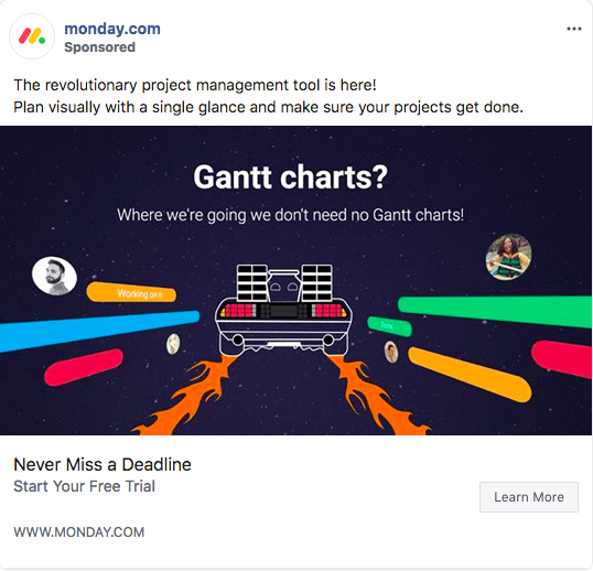
What makes this ad stand out?
It’s an eye-catching ad, relevant, and very visual. It also includes an enticing value proposition – a project management tool that’s “revolutionary”. The headline that promises you’ll “Never Miss a Deadline” and the free trial have high chances to make the user click the “Learn More” button.
Example 13 - Fiverr (Video Ad)
What makes this Example stand out?
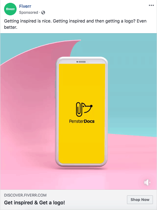
Well, it is the power of the double benefit: getting inspired and getting a logo. Try testing this kind of simple, catchy, and straight to the point headlines and see how they work for your campaigns.
THAT’S A WRAP!
By now, you should have a better sense of what makes a good Facebook ad. So take this as an inspirational post that will help you unlock your social ads potential.
Are you looking to create a successful Facebook campaign but don’t know where to start? Let’s talk more about your small business, we would be happy to help you!
Until next time, unleash your creativity! 😉

